What are the web design basics I need to know for my pages?
You’ve decided on your website topic, narrowed down the angle you want to take, selected your name for $0.99 on GoDaddy, and you are ready to start designing. Your first inclinations may be to choose your favorite colors, make it pretty with some animated fonts, and add some sunbursts to make it “pop.”
Ugh. Please. Don’t.
Fortunately, people have gotten a lot better at web design and we don’t see as many of the disasters that used to proliferate sites like MySpace. Kitties flying across the page with rainbows and stars? Sure! Dragon font with fire coming from the crossed “T”? Absolutely.
But today’s web browsers know what they want in the design and layout of sites they will spend their time enjoying. Keep these tips in mind when you are setting up your site, and refrain from blinking WordArt at all costs.
Once a query is made on Google for that particular word or phrase, ads from matching advertisers are then shown to the person who made the query.
Simplicity
Readers don’t like complicated text with too much to read through unnecessarily. When thinking about headers and headlines, remember that simple is best.
Keep the reading level between 8th and 11th grade (depending on your topic). Use short sentences. Avoid lists of adjectives. Make each word count.
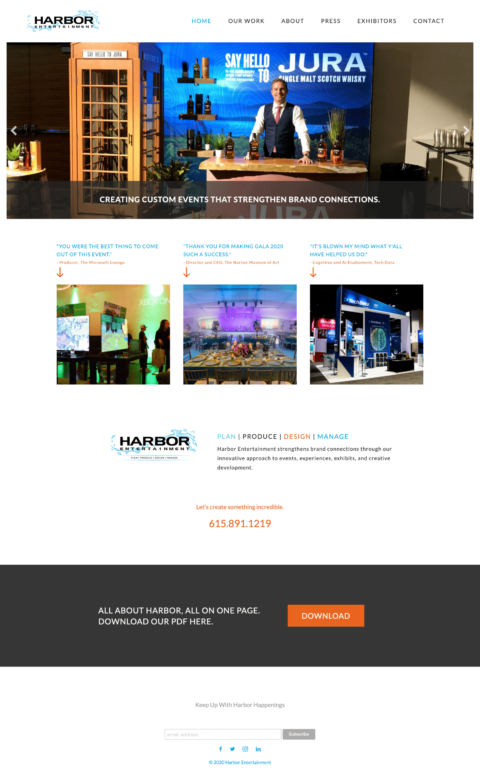
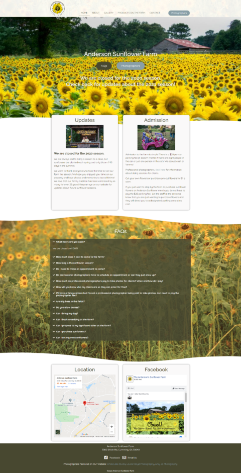
White Space is Important
White space helps to guide the eyes to the critical information that you want your reader to see. When every inch is covered with graphics or text, the visitor doesn’t know what is important – everything looks the same.
Use white space to your advantage. Keep paragraphs short and make the copy easy on the eyes.
The competition on Google can be quite stiff and it’s important that you find a way to stand out from the crowd. If your ad copy is weak, you will not be able to generate the click. Ultimately, no click means no traffic and no leads.
If you want to fully capitalize on the power of Google AdWords, you need to spend a fair amount of time ensuring that your ad copy is strong, targeted towards your ideal customer, and congruent with your landing page. If you focus on these factors, you will have far greater success with your ads and click-throughs.
Continuity
If you have a web page with one design and then run your ads with other designs, the continuity is off. Colors and fonts should flow from one page to the next. Much like a corporation will have design guidelines, make sure you follow your own design from page to page, and project to project.
Another way continuity is affected is with content. When a user clicks on your ad for a cat product, but then arrives to your home page full of dog and fish products, continuity suffers. So, for design and context, you must make sure things line up.
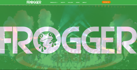
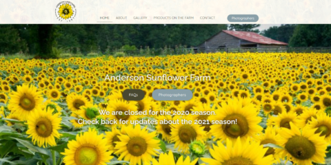
Color structure and planning Speaking of colors, you want to aim for having just two or three. Don’t be excessive with accent colors or “extras.” Strive for strong contrasts to make things easy to view. In other words, dark blue text on a black background or yellow on a white background are too difficult to discern.
Effective images
The photos you choose to appear on your site should be congruent and relevant to what you’re talking about. Find the most interesting and engaging images you can. Use professional images with proper lighting from free-use sites or buy stock photos. Consider that photos with people tend to be looked at more than photos without people.
Take these tips into account and start planning your design offline before you enter your web builder. By getting these key ideas clarified first, your build will have the direction to keep you focused on your design path.
Another way continuity is affected is with content. When a user clicks on your ad for a cat product, but then arrives to your home page full of dog and fish products, continuity suffers. So, for design and context, you must make sure things line up.
Color structure and planning Speaking of colors, you want to aim for having just two or three. Don’t be excessive with accent colors or “extras.” Strive for strong contrasts to make things easy to view. In other words, dark blue text on a black background or yellow on a white background are too difficult to discern.